
Intro
Whenever I get a big race on the books, I love diving into my spreadsheets. I have a spreadsheet for every major race I’ve done, and one of the most important tabs is a simple table; Aid Stations with their mileage across the top, different paces down the side, with the cells filled in with the time I would arrive corresponding to the Aid Station column and Pace row for that cell.
The importance of this table is that for ultra distances that entail running through the dark, it is not only very helpful for my crew to have a good estimate on when I’ll arrive, but also essential for knowing which sections I’m likely going to be in the dark so I can ensure I have the necessary gear. The simple method I’ve been using thus far has been fine, but an upcoming race had me thinking of ways to improve it. The Teanaway 100 starts off with a 7.5 mile climb. This is sure to throw off my pacing chart. So I wondered if it’d be useful, or in any way better, to analyze some of my past races (restricting myself to the longer ones for a more relevant dataset) to come up with a grade-adjusted pace predictor and apply that to the actual race elevation profile to predict more accurate Aid Station arrival times.
Method
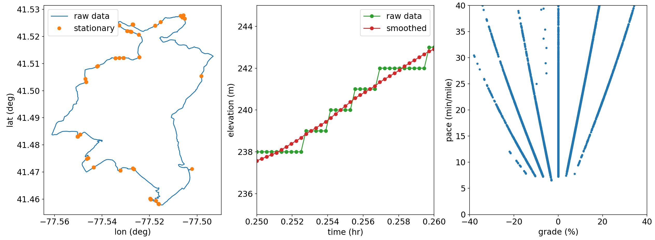
To begin, I just wanted to dissect a single run to see how the data looks. Here I’m analyzing a 20 mile run I did recently in the PA Wilds and should give a decent dataset to work with. A few considerations arose when working with the data. First, shown on the left in the plot below, there are multiple times when the data records consecutive data points at the same lat/lon, ie times when I’m not moving. In developing a pace predictor model, I want to avoid the infinite paces here so I removed consecutive duplicates. (Infinite pace sounds fast, but when talking about minutes per mile, bigger = slower). Second, shown in the middle, it’s noteworthy that the elevation data is only available to the nearest meter. I smooth this out by averaging the elevation of points within 10 meters of each point. Without this smoothing, plotting the computed pace vs grade (discussed below) shows a set of lines radiating from the origin, shown on the right. The cause of this comes from a finite number of integers being averaged; consider the units of pace [time/dist] and grade [elev/dist]- the slope is then [time/elev] and since the watch records a datapoint every second and elevation to the nearest meter, we are left with a series of lines that depends on the distribution of varying elevations in the averaging.
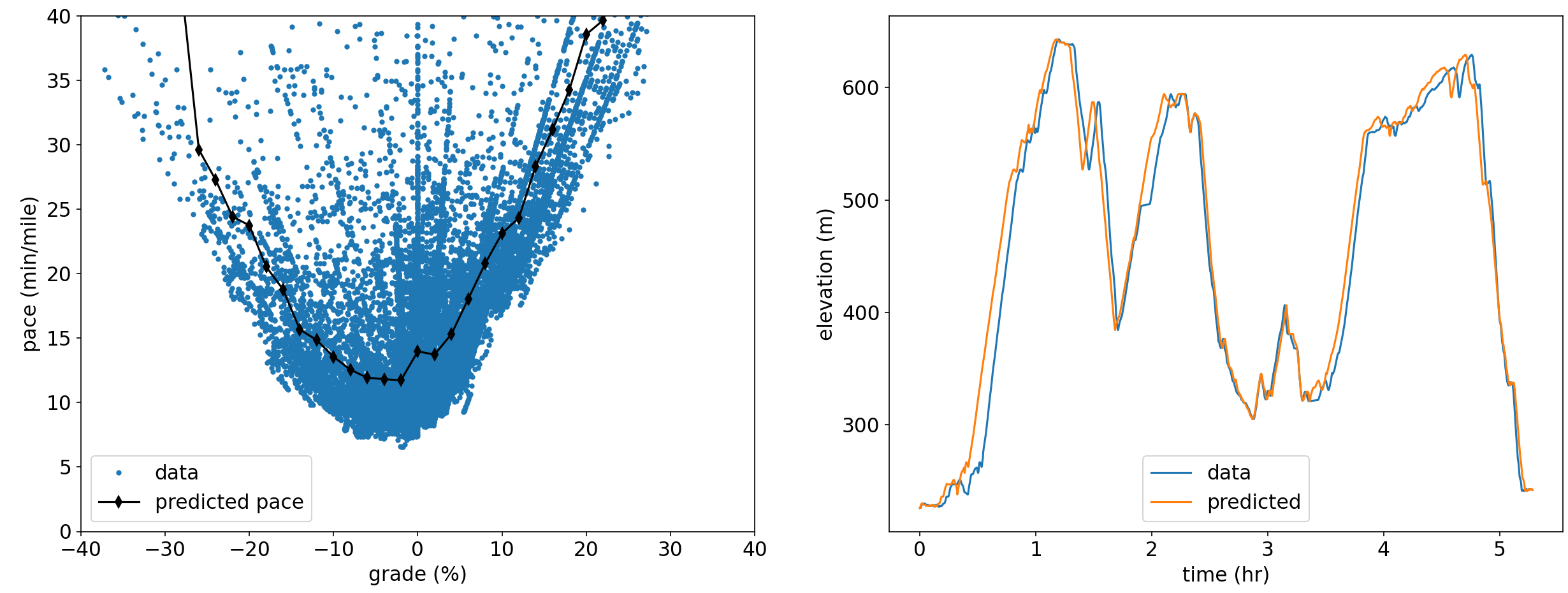
By using the smoothed data and computing the grade and pace for each segment (ensuring a finite pace since we removed segments of 0 length already), I binned and averaged the pace data. I restrict the data to the fastest 75% in each bin wanting to ignore the extremely slow pace outliers that would skew the data. The raw datapoints and the predicted pace vs grade is shown below. Because we ignored the slowest paces in the binning and averaging, and because we omitted stoppage time by removing duplicate points from the original dataset I normalized the time computed from the pace prediction to the total run time to preserve an accurate total time prediction for this run.
We can now turn around and take the predicted pace vs. grade model and apply it to the original data, shown on the right below. The total time matches, as expected since we corrected for this already, and the discrepancies between the two are a result of two factors- first, the model does not predict any stationary time but accounts for it in a lower average pace, and second assumes a constant pace at each grade eliminating the natural variation from the actual data.
 The plan now is to compute such a pace predictor model for a number of long runs to see how varied they may be (whether by differences in training, fatigue, or terrain), compute a “master” predictor model by averaging the individual run models together, and apply it to data for an upcoming race to (hopefully) more accurately predict my arrival times at Aid Stations.
Multi-Run Analysis
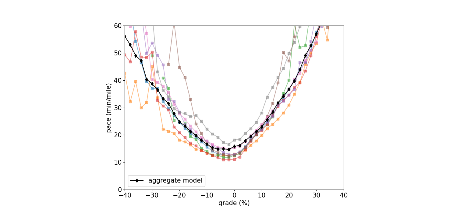
I assembled the data files from a number of my longer trail runs and ran them through the method developed above, and found that a fair number of them required some manual processing. It was not uncommon that there would be an error in the time data. The watch records a point every second, but quite commonly a point would be off by hours, even days. A lot of cleaning was necessary. However, I hope this is due to errors in the watch itself which I returned after the World’s End 100k. We’ll see if the new watch has the same issues.
I computed a predicted pace curve for each run invididually, but aggregated the raw data for each run before computing the final pace predictor model curve to improve the statistics for each bin. It should be noted that the raw data for each run was scaled to the total time of each run. The reason for this is because in the analysis I throw out the outliers (anything above a 2 hr per mile pace), so by scaling the raw data we’re adjusting the remaining data such that the computed time matches the total run duration. The curve for each run and the pace model from the aggregated data is shown below.
Applying the Model
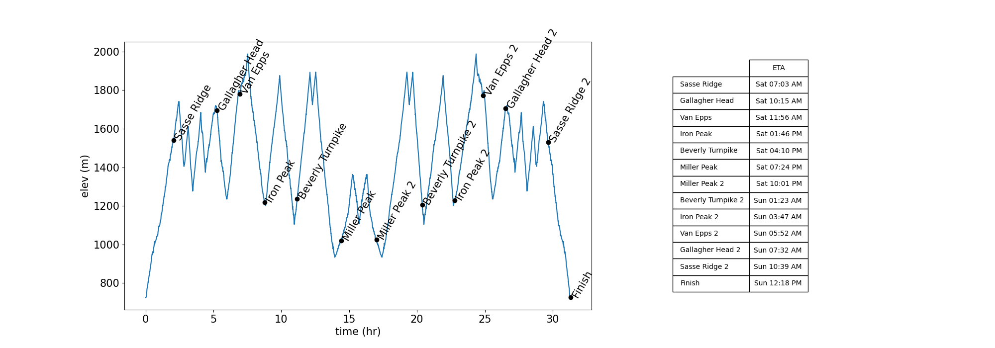
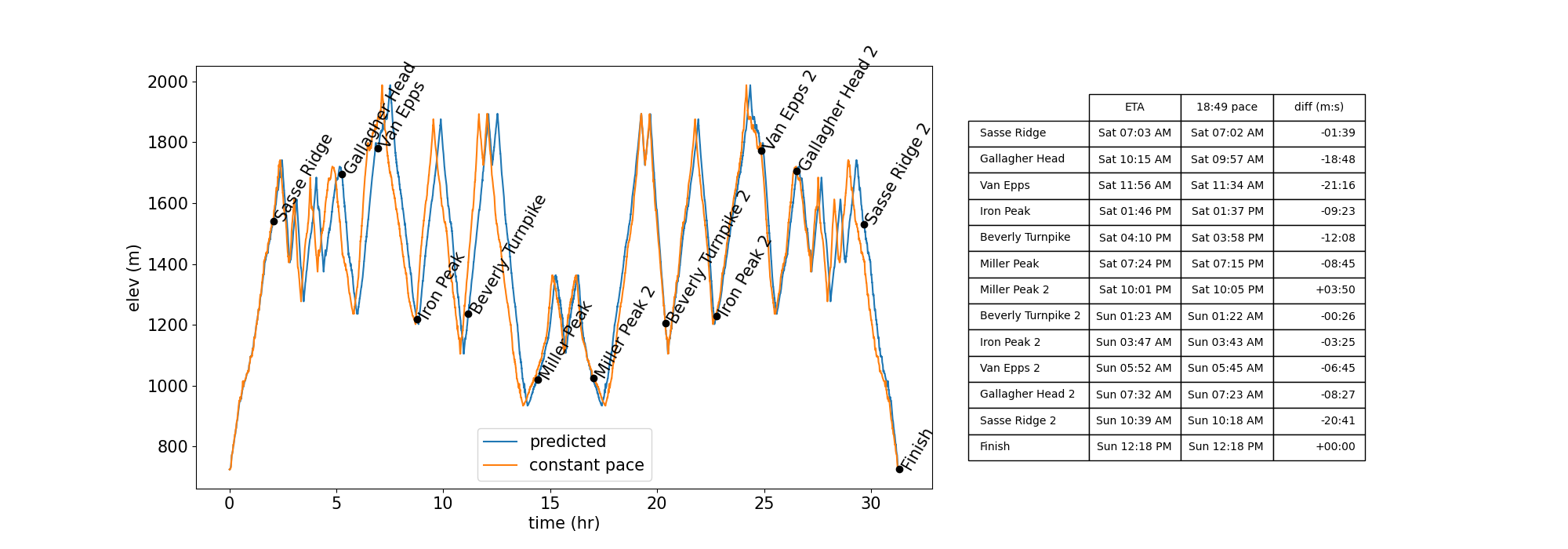
The Teanaway 100 route can be downloaded from the race website. I also created my own version, which has finer gpx data, using AllTrails. Using this gpx data we can compute the grade for the route as before, then apply the pace model developed above to predict pace along the course, along with a final finish time of 31’18”. The figure below shows the elevation profile vs time with the aid stations marked and the arrival times shown in the table.
I’ve taken a stab at creating a more nuanced predictive model that incorporates actual pace data instead of assuming a constant pace as shown in the table at the top of this post. So it is worthwhile to compare the new model to the old method. Using the computed finish time of 31’18” and using the corresponding constant pace of 18:49 min/mile, the figure below shows the route elevation vs predicted time and time computed using the average pace value. The aid station arrival times are compared in the table. We can see that by using the predictive pace model I expect I’ll arrive later than expected (with the exception of Miller Peak 2). The differences are usually fairly minor, but can be upwards of 15-20 minute delays. I figure that’s enough to make my crew start to worry, so using the predictive model should help give more accurate arrival times.
Post-Race Thoughts
My actual finish time was 36:16:00. Clearly the pace predictor model did not hold up in this case. The race was incredibly fun and beautiful, but the terrain and elevation were brutal! I will continue to update my personalized pace-predictor model and apply it to future runs. It may have limited usefulness in the long run, but modeling this was a worthwhile investigation. What would be the most useful for my crew would be an adaptive pace-predictor model that updates in real time as I pass through aid stations. I have a version of this working in Excel, but so far it hasn’t seen any actual field use. Updating spreadsheet values in the field is challenging but possible. If I can think up an easier interface in the future this may turn out to be the most useful method for my team.